Yes—color analysis works for men because it’s based on universal traits like skin undertone, contrast level (the difference between your hair, skin, and eyes), and how certain colors reflect light onto your face. Those factors don’t change based on gender; they change how sharp, healthy, and balanced you look in different shades.
A good palette makes everyday choices easier and more consistent. Instead of guessing which navy, gray, or olive looks “right,” color analysis narrows you to versions that naturally match you. The payoff is subtle but real: fewer washed-out photos, fewer outfits that feel slightly “off,” and more pieces that mix and match without effort.
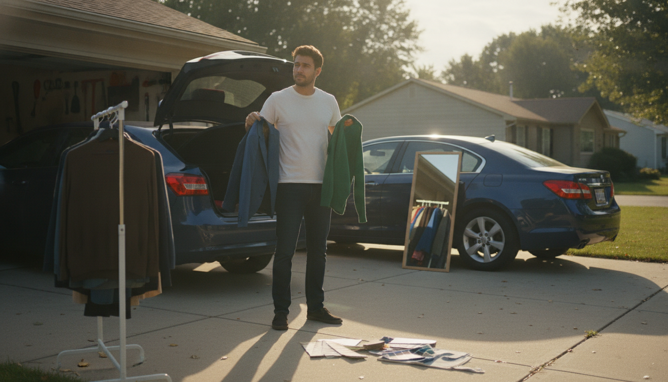
It’s especially useful for staples men wear often—T-shirts, dress shirts, sweaters, jackets, and suits—because these items sit close to the face. When the shade is right, your skin looks clearer and your features look more defined; when it’s wrong, you can look tired or sallow even with a good haircut and fit.
The method is the same, but the application can be more streamlined. Many men don’t want a closet full of bright colors—and they don’t need one. A men’s palette often focuses on neutrals and “quiet” colors: the best whites, charcoal vs. warm gray, the right navy depth, and which browns (or black) look strongest. Accent colors can stay minimal—think ties, pocket squares, polos, or sneakers—while still benefiting from a coordinated range.
You can get a strong result at home by testing a few controlled comparisons: warm vs. cool (cream vs. bright white), light vs. deep (heather gray vs. charcoal), and muted vs. clear (dusty blue vs. saturated blue). Good natural light matters, and it’s easier if you remove competing color (bright shirts, tanning, or strong indoor lighting).
For a step-by-step approach tailored to men, use this guide: Men’s Color Analysis: Find Your Best Palette at Home.
Skip shades that make your skin look gray, yellow, or overly red—often the wrong white, the wrong navy, or a too-bright neon. Once you know your undertone and contrast level, the “avoid” list usually becomes a few predictable shades rather than whole colors.


Leave a comment